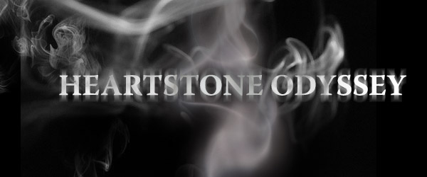
The weekly Heartstone activities this week consisted of Kathryn and I sitting at my computer on photoshop for a good hour and a half and debating over which fonts we didn't and did like for the Header.
Kathryn, apprantly thinks the cheekbone on one of the characters is too big, to which I replied: "Well it looks fine to me!"
It was rather funny, especially afterwards when our teacher then told us (because we were in the middle of class ;P) that we sounded just like him and his friend. I suppose we must have been quite loud now I think about it, there was only four people in the room that afternoon because everyone else had another class they needed to be at.
There were many different fonts that we went through. But then photoshop does have a lot of them! And by the end of it, we still couldn't decide which font we liked the best. But once we'd narrowed it down, we realised that:
1. The original font that we both liked didn't go with the header.
2. One of the fonts (which we both happened to like the best) just happened to be the same one that another webcomic used. A very popular webcomic for that matter, so we decided against it.
3. The same font that was used for another webcomic is the same one as the font used for Final Fantasy... which we then saw on a bus as we walked out of college! It was very amusing.
4. None of the colours we tried, would work. The goldy yellow merged itself into the background, the blue was too light, the darker blue was too dark, the black didn't look right and by the time we'd gotten through that it was time to leave.
I think Kathryn wants to redesign the header. Maybe then we'll think of a colour scheme, until then though I'm happy to stick with the one we've got.
I rather like it despite Jack having a supposedly too big cheek.
Us creative s, never satisfied eh? Which reminds me, I need to go and change a bit of dialogue in Heartstones.
That's something I'm not satisfied with!
No comments:
Post a Comment